|
|
 |
 |
 |
|
| |
Strawberry Software, Inc. Unveiled New Corporate Identity, Expressing Love and Caring for Children
2004/04/01 |
|
|
| |
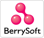 Meet the new corporate identity of BerrySoft after 12 years of operation. The official logo is consisted of three pink round circles to replace the image of strawberry which has been used since the establishment of BerrySoft. By the new logo, BerrySoft not only declare the new corporate positioning, but also express the determination to succeed in the digital learning fields.
The previous logo had successfully impressed the consumers with the look of strawberry image in vivid red and green symbolizing the energy of our children. The three white dots stand for audio, image and animation individually and our commitment to provide quality digital learning products.
Sandy Shen, Chairman of BerrySoft explains the reasons for switching to a new logo, "By unveiling our new identity, we will step into a brand new milestone and get rid of the previous image which is more concrete and somehow stereotype the corporate image of BerrySoft."
The elements of the new logo are two joint balls symbolizing parents while the separate ball as the children. Together, both parents make their best effort to raise their children, provide what they need and educate them into a healthy successful individual. With the love and caring, BerrySoft feels the same way as the parents, hoping all the children could be raise in such healthy pleasant atmosphere.
The new corporate identity inherited the vision and spirit of the previous one, and infused with modern touch and taste closer to the younger generation.
The shape of the new identity simply release wilder space for imagination and with the vivid color symbolizing the optimistic attitude when facing to challenges, BerrySoft is revived and ready to step into the next generation.
The naming of BerrySoft is the most significant issue of the year. Being the business brand of BerrySoft. BerrySoft had not owned an official name in English. However, in order to emphasize the global presence, a corporate name in the internationally common language is in need. Therefore, the name "BerrySoft" perfectly interpret the brand spirit and the personality of this corporation.
The prefix of BerrySoft, "Berry", gives out the impression of brilliant, young, happy and bright image. "Soft", on the other hand, is the short for software representing that BerrySoft is a brand with highly advanced digital technology. With the combination of the two words, BerrySoft delivers not only the brand personality but also the attitude.
BerrySoft stands for brilliance, energy, happiness and optimism. Our ambition is more than being the expert in digital learning, but to succeed in bringing an optimistic attitude and a wonderful experience through life.
With the new look of corporate identity, BerrySoft has officially step into a brand new milestone. In the near future, BerrySoft will spread out its antenna and migrate from digital learning for children to all the other educational fields. By uplifting the brand to have an international perspective, BerrySoft is now dedicated and ready to devote its most sincere effort to the development of digital content around the world.
|
|